SUPPLIES
Oh, the thrill of walking into an art supply store and seeing all those pretty paint tubes lined up, calling to you to bring them home. But before you blow your budget, consider a few things: You don’t have to have it all. A few tubes of paint, a surface to paint on, and a brush or two will give you a good start. I suggest using a variety of materials for the projects in this book, but I encourage you to be resourceful. Adapt with what you have on hand, substitute when possible, and be innovative with your supplies. If you are interested in learning about art supplies, we’ll review the possibilities in this chapter.
DISCOVERING YOUR SIGNATURE COLOR PALETTE
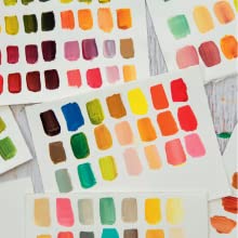
Color is part of my identity as an artist. I’ll bet that if you looked at your work, you would see a color pattern as well. When you paint, do you have a go-to palette or know how to identify one that is materializing as your own signature color combination? A golden thread runs through your work and your life, and it’s the key to your own signature color palette. The best way to discover your signature color palette is to see the world with wonder. Figure out what lights your soul on fire and then embrace your natural path toward creative expression. Soon you will see color combinations everywhere you go that you simply can’t resist.
MODERN COLOR THEORY
Previously, color theory included hues such as ultramarine blue, cadmium red, and cadmium yellow. The newer colors of phthalo, quinacridone, and azo yellow are synthetic hues not found in nature and have revolutionized the way we create because they offer an incredible array of colors that you can’t get using the traditional color palette. Many artists have moved over to new and exciting possibilities with modern synthetic colors. This is where modern color theory comes into play. For printing and graphics, and now on your canvas, you can use primary cyan, primary magenta, and primary yellow. Let’s take a deep dive together into a whole new world of modern color theory.
PALETTES AND PROJECTS
One of the greatest pleasures in working with mixed media is that painting in layers is forgiving. You can correct mistakes and adjust your work along the way by experimenting with different mediums and mark-making tools. Be creative in your approach—use what you have—and substitutions are allowed. Nothing is a mistake in the process of making art. If something doesn’t go as planned, consider it serendipity, a chance to discover something unexpected in making your most authentic artwork.
TRICKY GREENS | PROJECT: DYNAMIC LANDSCAPE
In this lesson, you’ll see how a green-centric painting compares with one that is balanced with other colors and more natural hues of green. When painting landscapes, many of my students are inclined to use a bright St. Patrick’s Day green right out of the tube or mix a similar super-saturated color. To create a dynamic and interesting landscape, more variety is needed. That’s why we’re going to push the range of hues we use and include complementary colors.
INFINITE BLUES | PROJECT: SMALL SEASCAPES
This lesson will not only expose you to myriad blue hues, but it will also bolster your acrylic painting practice. If you don’t have a million blues like I do, return to the color wheel warm-up lesson (see page 36) and mix a variety of blues using the modern primaries. Once you have a nice selection, begin playing with paint and create these lovely small seascapes.
YELLOW ON TOP | PROJECT: MIXED MEDIA ABSTRACT BOTANICAL
Let’s get wild with our biggest project. This is a great opportunity to try out any of the mixed media techniques or ideas that we’ve covered, and we’ll see what happens when we bring it all together into one big yellow phenomenon. Don’t hesitate to make it your own!


.jpg)
I have no experience with paints. My nephew would teach me!
ReplyDeleteJan
Deletehttps://twitter.com/Handmadeby_Deb not working?
ReplyDeleteThank you Laurie! Much appreciated. Fixed.
DeleteI would consider myself comfortable mixing acrylic colors having done a lot of pieces, I haven't done anything in a few years though. I've never learned about color theory or discovered my personal palette or what really represents the artist part of me. I keep meaning to get back into it but life has taken many unexpected turns. This post and the studio is incredible and fascinating. I truly didn't know how much there was to learn as I was/am a hobby artist and pieces I've done have generally been abstract and how I interpreted the mixed media style. I'm rambling, so sorry. I'm just very excited about this.
ReplyDeleteI'm happy you commented!
DeleteI'm getting better at mixing colors, but I need a lot of instruction and practice.
ReplyDeleteI love mixing paints! Acrylic paint is so easy to use.
ReplyDeleteI do need help mixing as sometimes I am hesitant about results.
ReplyDeleteI'm not the least bit confident in the outcome but I'm certainly ready to give it a try. Thanks.
ReplyDeleteI'm not comfortable with acrylic paint yet.
ReplyDeleteI am comfortable with all mediums. I started out with chalk but I love oils and acrylics. I really need a refresher on mixing colors. Art is my hobby that I really enjoy but I do not get to spend a lot of time being creative anymore. No excuse but my own.
ReplyDeleteMy granddaughter would love this.
ReplyDeleteI am only slightly comfortable at mixing colors. It has been a long time since I have done so.
ReplyDeleteNancy
allibrary (at) aol (dot) com
I am not comfortable doing this but my sister who has taken some art lessons would probably love to learn more about this .love to win it for her.
ReplyDeleteI am not but my daughter is the artist and she loves trying new mediums.
ReplyDelete